When designing artwork inspired by Taylor Swift’s iconic albums, it’s important to capture the essence of her diverse musical eras. From the country roots of “Fearless” to the indie folklore vibes of “Evermore,” the choice of font plays a pivotal role in weaving together visual aesthetics with lyrical emotion. Canva’s user-friendly platform provides access to 11 fonts that resonate with the spirit of Swift’s discography. Each of these fonts contributes uniquely to the visual aspect of Taylor Swift’s albums, aligning with the themes, emotions, and stories she conveys through her music.
What we cover
1. Engravers Old English

Why for Taylor Swift: A gothic, blackletter typeface known for its ornate and historic appearance. This font could be used to give a vintage or classical touch, suitable for an album that aims to evoke a sense of history or timeless elegance, akin to the more narrative and folkloric elements in her music.
2. Satisfy

Why for Taylor Swift: A script typeface that combines classic calligraphy styles with a modern twist, offering both legibility and flair. It’s ideal for conveying a personal, handwritten feel, suitable for albums like “Folklore” or “Evermore” that emphasize storytelling and intimacy.
3. IM Fell
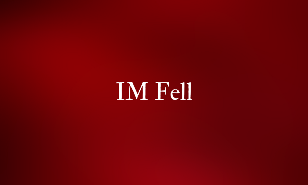
Why for Taylor Swift: A collection of typefaces based on the work of English typographer John Fell, known for their historical and academic feel. This typeface would be suitable for albums that channel a more serious, literary, or baroque style, adding a layer of historical richness and depth.
4. Garamond

Why for Taylor Swift: A classic serif font known for its elegance and readability, often used in print. Its timeless and sophisticated appearance makes it perfect for albums that aim to convey a sense of classic beauty and narrative depth.
5. Helvetica World

Why for Taylor Swift: An international version of the famous Helvetica font, designed to support a wide range of languages and scripts. This font’s clean, modern appearance and global appeal make it a versatile choice for any album, reflecting the universal nature of her music.
6. Lucida Italic
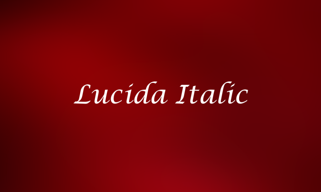
Why for Taylor Swift: Part of the Lucida family, known for its clarity and legibility, with the italic style adding a touch of elegance. Suitable for albums that require a mix of readability and sophistication, possibly for more reflective or poetic content.
7. ITC American Typewriter
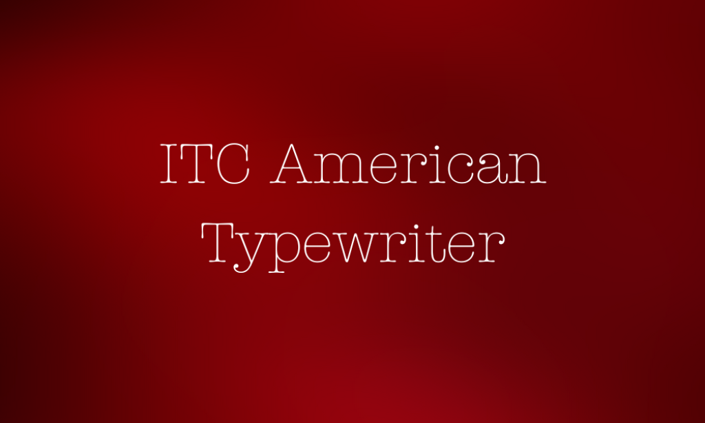
Why for Taylor Swift: A slab serif font that mimics the look of classic typewriter text, offering a retro, nostalgic feel. This font could be used to evoke a sense of nostalgia and authenticity, fitting for albums that draw on personal history or a retro aesthetic.
8. Futura

Why for Taylor Swift: A geometric sans-serif font known for its modernity and efficiency. Its clean and forward-looking style could complement albums with a modern, pop-centric sound, like “1989” or “Reputation.”
9. Caslon
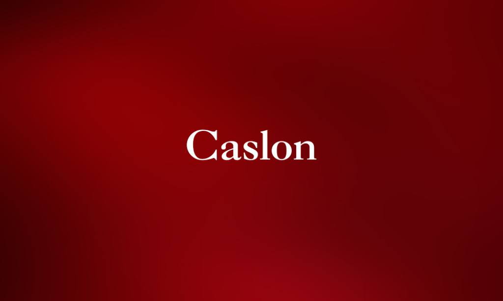
Why for Taylor Swift: A traditional serif font that exudes a timeless, authoritative quality. With its classic and formal appearance, it’s well-suited for albums that aim to convey a sense of sophistication and enduring appeal.
10. Malibu Ring

Why for Taylor Swift: Malibu Ring suggests a casual, relaxed, or playful font style, which could be suitable for more upbeat, carefree tracks or albums like “Lover.”
11. Callem

Why for Taylor Swift: Ideal for personal, intimate album themes, giving a handwritten touch that could fit the personal storytelling found in Taylor Swift’s “Folklore” or “Evermore” albums.