If you’re a fan of the clean and versatile Calibri font but are looking for a bit of variety for your Canva designs, you’re in luck! There are plenty of fantastic alternatives that offer the same readability and modern flair. In this article, we’ll explore 15 of the best Calibri alternatives you can find in Canva. Each of these fonts offers unique features that make them worthy alternatives to Calibri in Canva, providing a range of styles from professional to playful that can enhance any design project.
What we cover
1. Arial
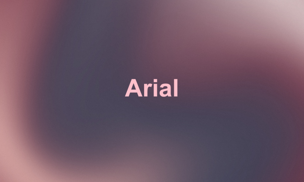
Why it’s great Calibri Alternatives: Arial is one of the most ubiquitous sans-serif fonts in the digital world, recognized for its clean, neutral design and excellent legibility. It’s a great alternative to Calibri because of its straightforward appearance and widespread availability. It’s a safe choice for designers who need a reliable, no-frills font that is almost universally readable.
2. Asap
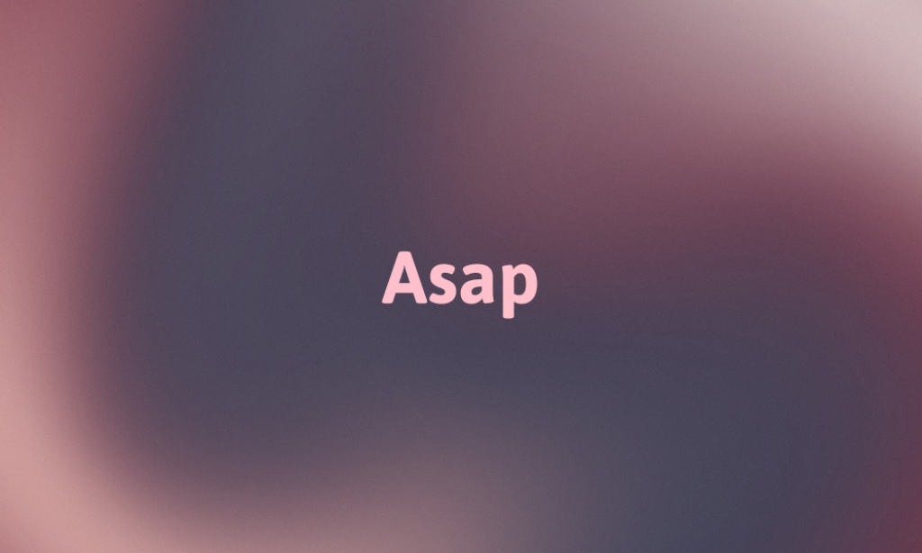
Why it’s great Calibri Alternatives: Asap is designed for both screen and print usage, featuring rounded, open letterforms that offer clear readability. It’s a great alternative to Calibri because of its professional yet friendly appearance, making it suitable for business documents or casual designs alike.
3. Avenir
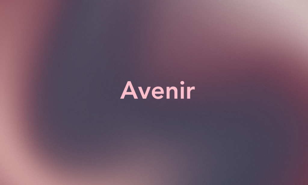
Why it’s great Calibri Alternatives: Avenir is a geometric sans-serif typeface that embodies an organic, highly readable style. It’s more polished and distinctive than Calibri, providing a touch of elegance to any design.
4. Cabin

Why it’s great Calibri Alternatives: Cabin is a humanist sans with open letterforms and a warm touch. It provides a slightly more casual tone than Calibri, which can be perfect for informal presentations and friendly interfaces.
5. Century Gothic

Why it’s great Calibri Alternatives: With its wide, open letters and uniform thickness, Century Gothic offers excellent readability and a futuristic vibe that stands out in both print and digital formats, making it a stylish alternative to Calibri.
6. Fira Sans
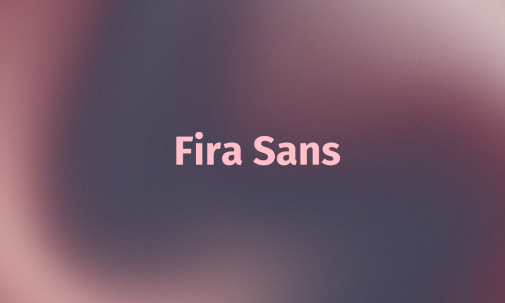
Why it’s great Calibri Alternatives: Originally designed for Mozilla, Fira Sans is known for its wide range of weights and strong character. It offers great versatility and readability, making it suitable for web and mobile interfaces.
7. Gill Sans
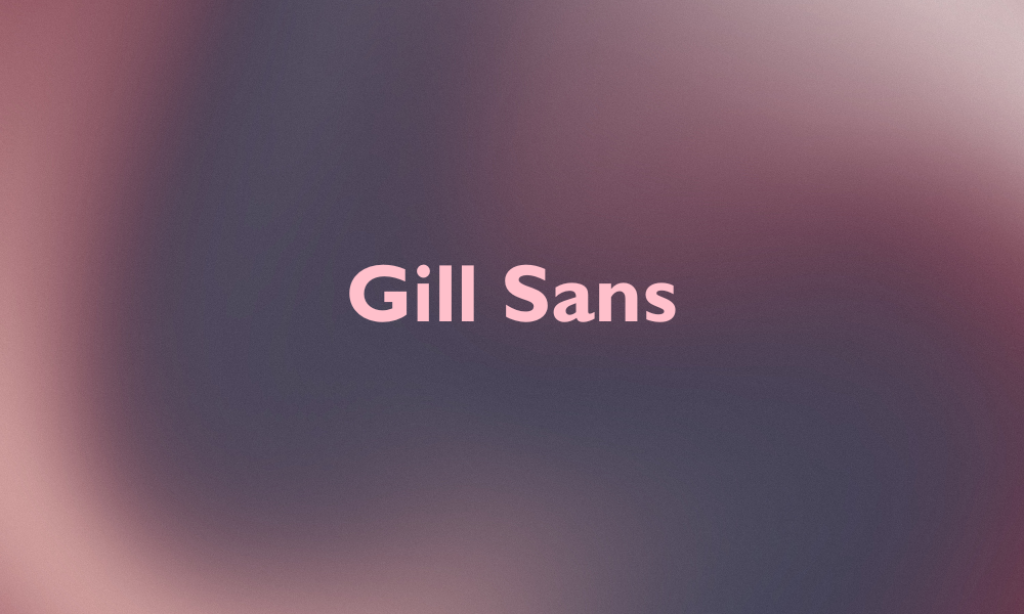
Why it’s great Calibri Alternatives: Gill Sans is a humanist sans-serif with a much softer tone than Calibri. It lends an air of approachability and simplicity, ideal for any project looking to convey clarity and warmth.
8. Gotham
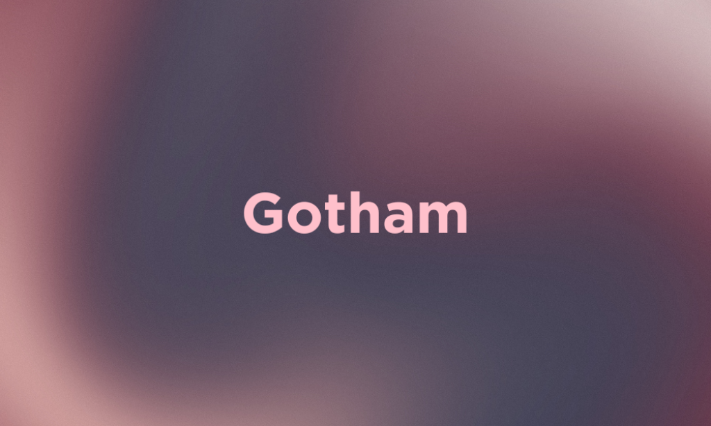
Why it’s great Calibri Alternatives: Gotham is incredibly popular for its modern, clean, and professional appearance. Its geometric simplicity and wide range of weights make it a versatile choice for any type of project.
9. ITC Franklin Gothic LT

Why it’s great Calibri Alternatives: This version of Franklin Gothic maintains its traditional American grotesque style but with improved legibility for modern uses. It’s robust and flexible, making it great for both headlines and body text.
10. Nirmala UI
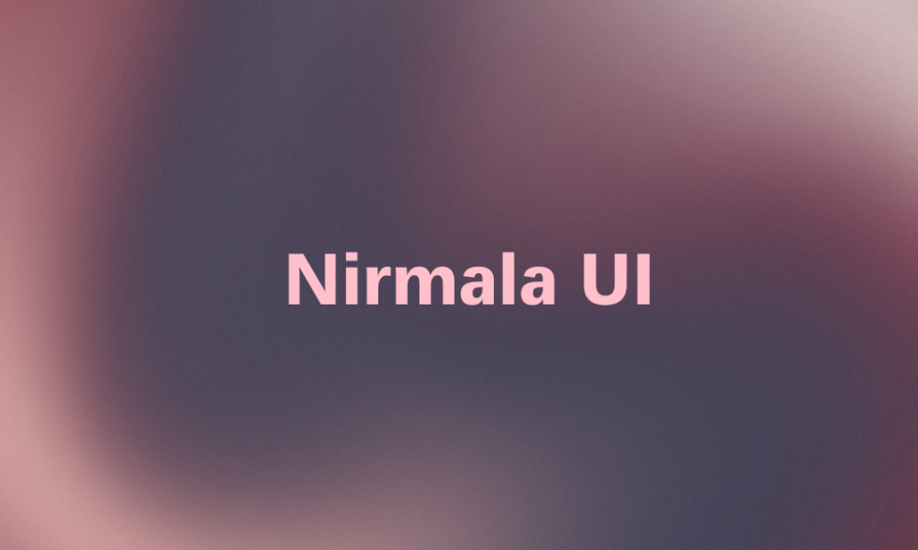
Why it’s great Calibri Alternatives: Designed primarily for interfaces, Nirmala UI supports a wide range of languages and scripts. It’s clear and easy to read, which makes it a practical choice for multi-lingual projects.
11. Poiret
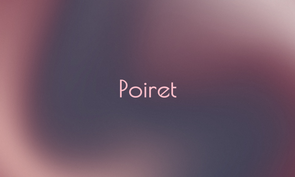
Why it’s great Calibri Alternatives: Poiret is a decorative geometric sans-serif with a unique character. It’s excellent for titles and headers, providing a touch of Art Deco elegance to any layout.
12. Proxima Nova
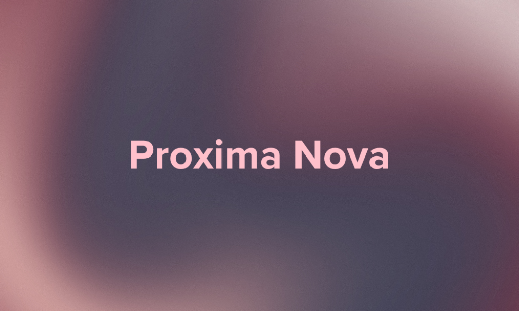
Why it’s great Calibri Alternatives: Bridging the gap between typefaces like Futura and Akzidenz Grotesk, Proxima Nova is a modern sans-serif that combines geometric proportions with a hybrid aesthetic, making it incredibly versatile and readable.
13. Tahoma

Why it’s great Calibri Alternatives: Tahoma is a tight, compact font that offers a clear and efficient reading experience on screen. It’s an excellent all-purpose font that works well in both body text and headings.
14. Trebuchet MS

Why it’s great Calibri Alternatives: Designed to be a versatile, readable font for the web, Trebuchet MS features a strong structure with a friendly tone. It’s great for instructional texts, user interfaces, and more.
15. Verdana Pro
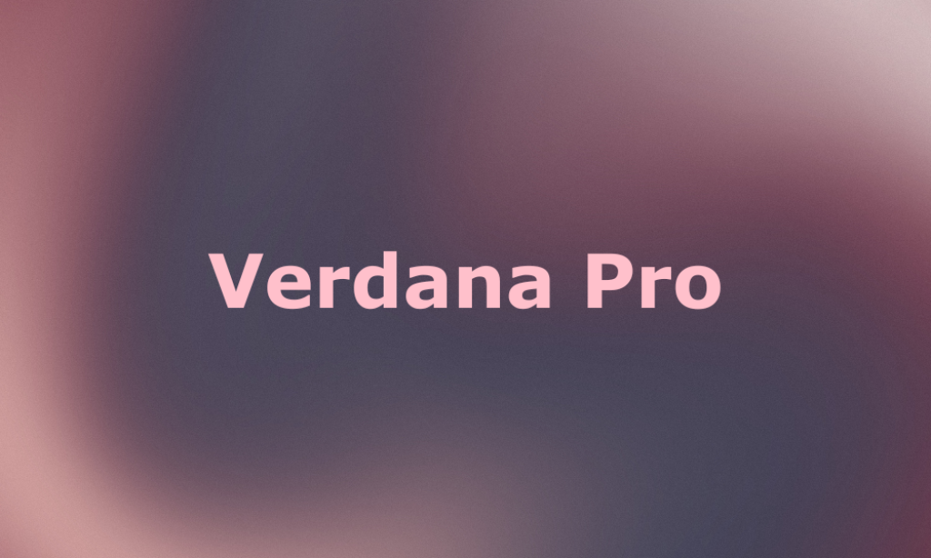
Why it’s great Calibri Alternatives: Verdana Pro is an expansion of the classic Verdana, known for its high readability at small sizes. The Pro version includes a wider range of weights and styles, enhancing its functionality across various applications.


