The 1960s was a vibrant and transformative decade, not just in music and fashion, but also in the world of typography. These typefaces not only captured the spirit of the ’60s but also left a lasting impact on design that can still be felt today. In this article, we’ll explore 15 iconic fonts from the 1960s. Each font tells its own story of the era, reflecting the pop culture, technological optimism, and radical artistic movements of the time. Whether you’re a designer looking for vintage inspiration or a history buff curious about graphic design, these fonts offer a fascinating glimpse into the creative legacy of the 1960s.
What we cover
1. Art Nuvo
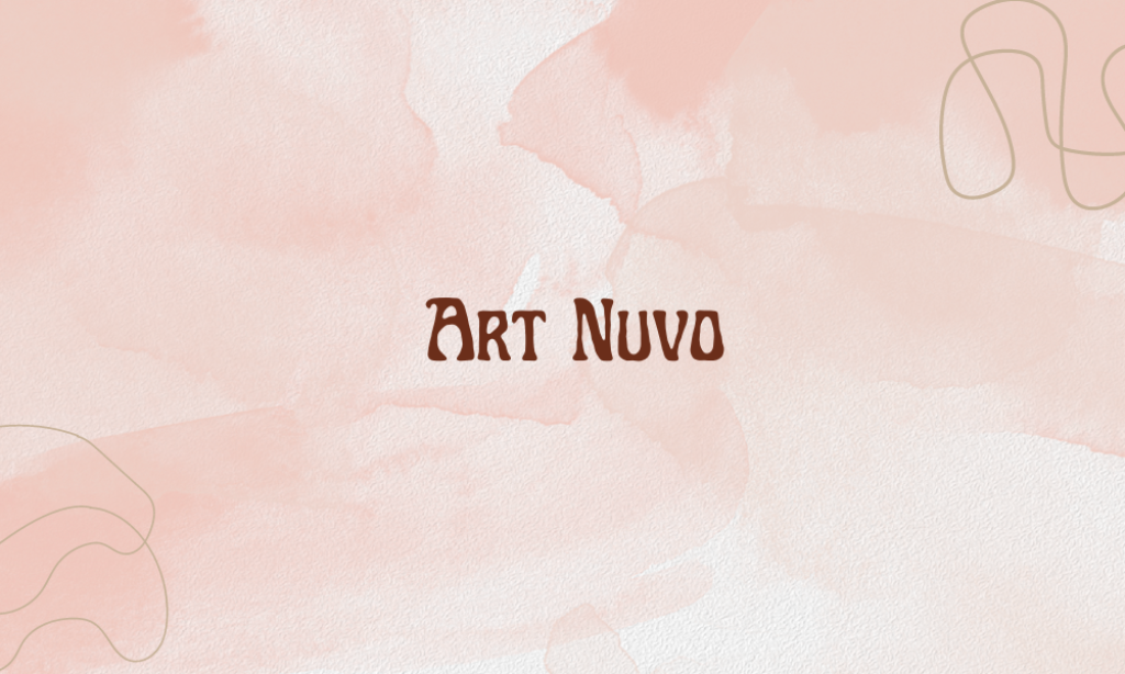
Why it is an Iconic 1960s font: Its ornamental and flowing curves are reminiscent of the 1960s’ fascination with organic forms and intricate line work. Characterized by its elegant, curved lines and floral motifs, perfect for evoking a vintage aesthetic.
2. Avenir
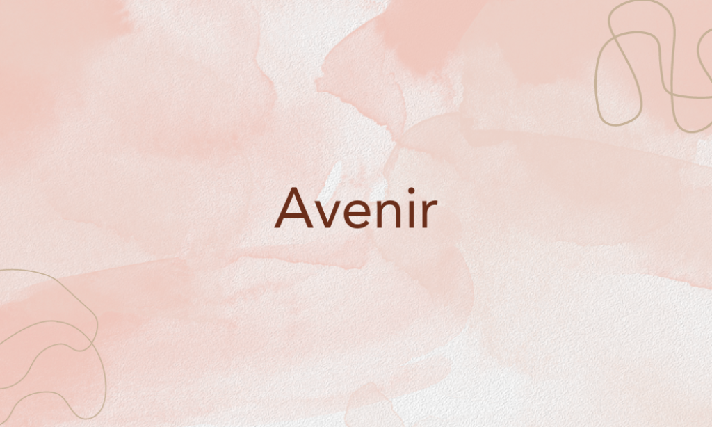
Why it is an Iconic 1960s font: Although designed in 1988, Avenir’s clean and modern geometry is reflective of the streamlined sans-serif styles that were popularized in the 1960s. Its inclusion speaks to the lasting influence of 1960s minimalism in typography.
3. Bodoni FLF
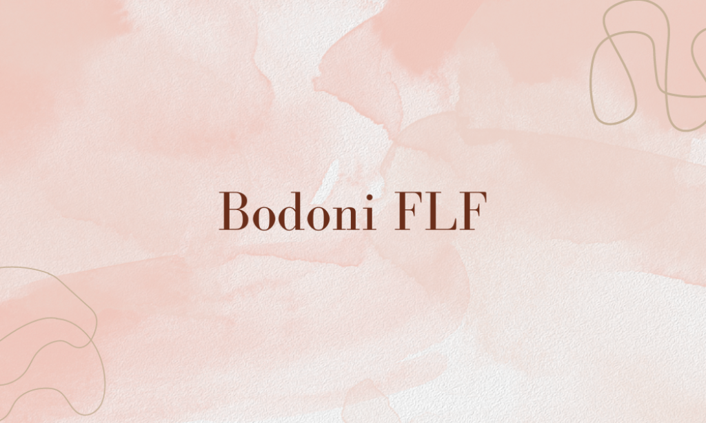
Why it is an Iconic 1960s font: Bodoni’s modern typeface design, characterized by sharp clean lines, extreme contrast between thick and thin strokes, and graceful curves, aligns well with the bold and striking visual themes of the 1960s advertising and headline text.
4. Copperplate Gothic
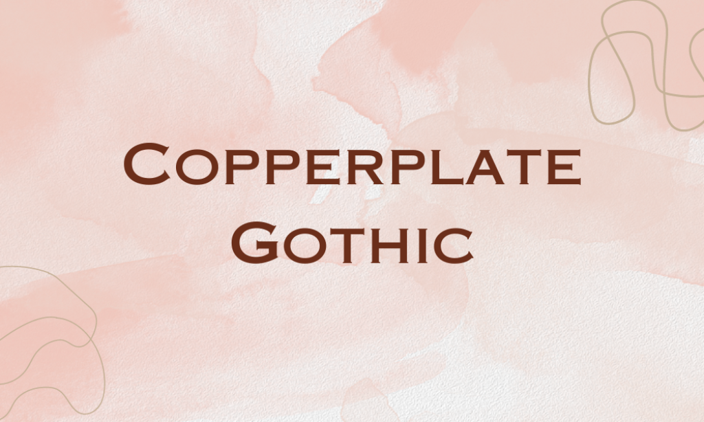
Why it is an Iconic 1960s font: While older than the 1960s, Copperplate Gothic was a popular choice for stationery and print advertising during the decade due to its formal and authoritative feel, which reflected the corporate culture of the era.
5. Futura Black
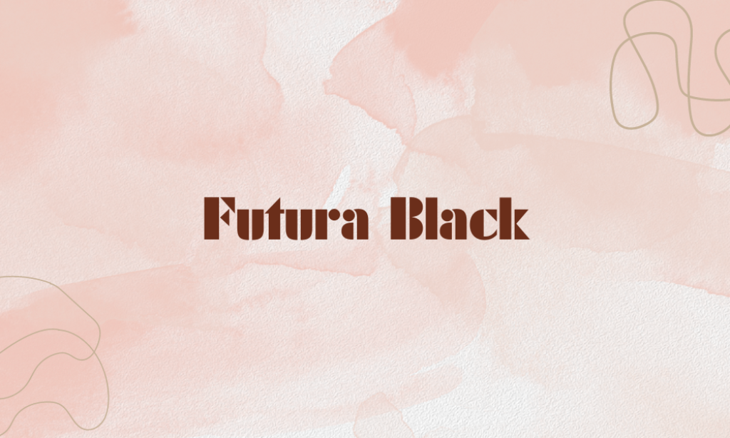
Why it is an Iconic 1960s font: Futura Black is a variant of the classic Futura, an emblem of Bauhaus design principles that gained popularity in the 1960s. Its distinctive stencil design captures the experimental and bold geometric shapes popular in 1960s graphic design.
6. Gill Sans
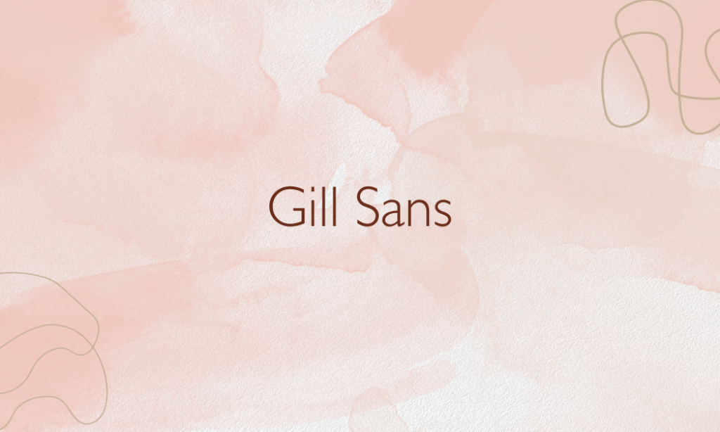
Why it is an Iconic 1960s font: Gill Sans, designed in the 1920s, was widely used in the UK and worldwide by the 1960s, appearing in everything from railway signage to publishing. Its clean and legible style epitomizes the mid-century modern aesthetic.
7. HK Carta
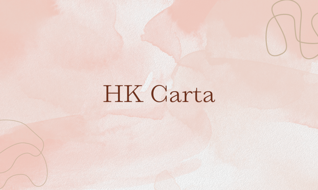
Why it is an Iconic 1960s font: Although not a vintage 1960s font, HK Carta’s simple, geometric design draws heavily on mid-century modernist influences, making it reminiscent of the type styles that were prevalent in graphic design during the 1960s.
8. ITC Avant Garde Gothic
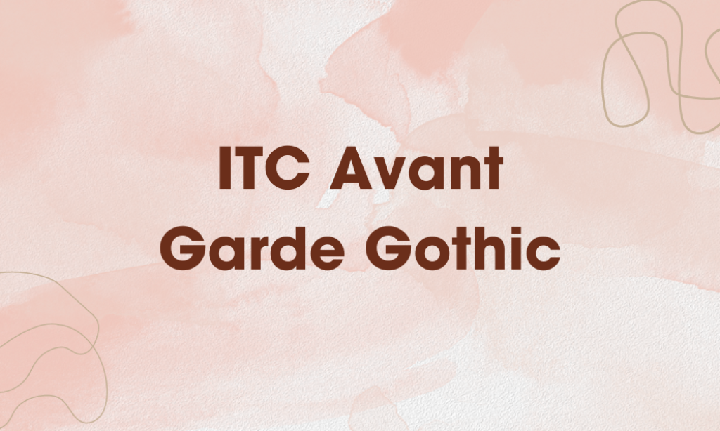
Why it is an Iconic 1960s font: Directly inspired by the 1960s avant-garde movement, this font embodies the geometric and minimalistic designs that were popular during the era. It was developed in the 1970s but based on 1960s aesthetics.
9. ITC Benguiat
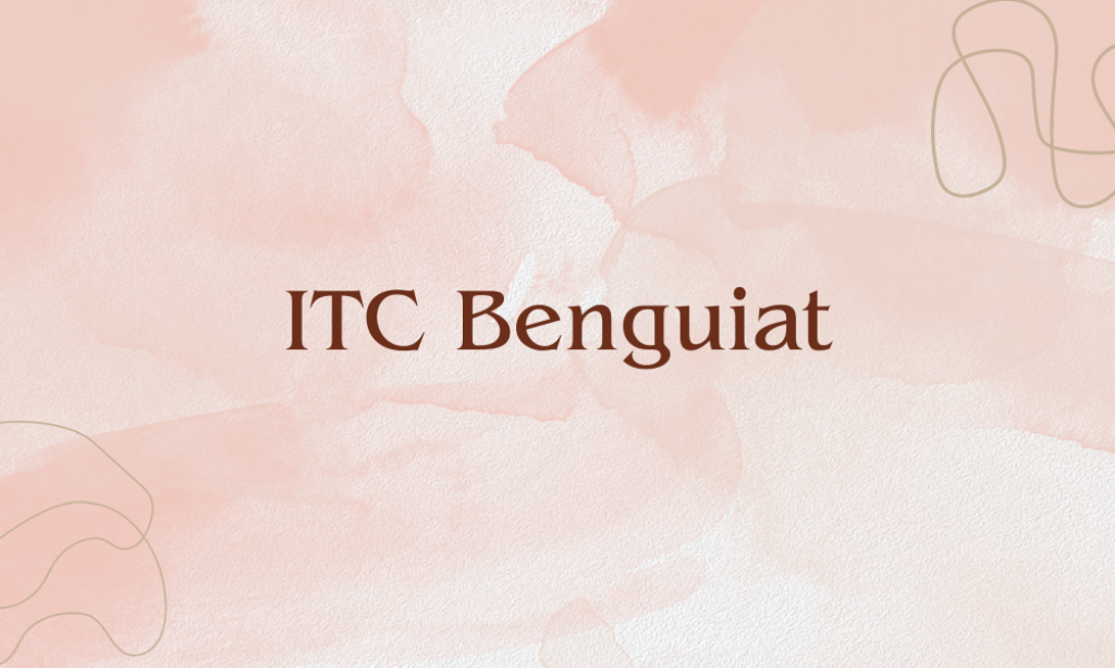
Why it is an Iconic 1960s font: Designed in the late 1970s, ITC Benguiat draws on Art Nouveau and psychedelic styles that were prominent in the 1960s. It captures the groovy, retro feel that is often associated with 1960s pop culture.
10. ITC Zapf Chancery
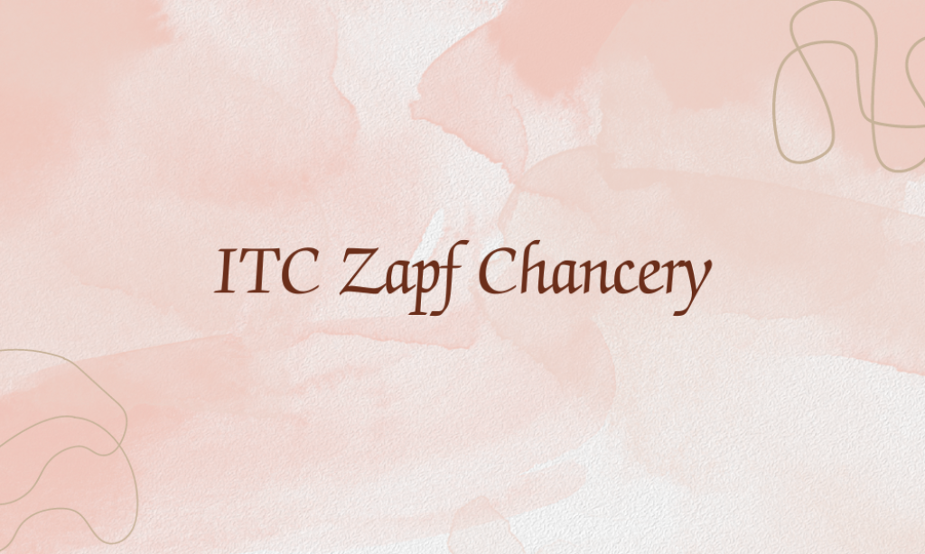
Why it is an Iconic 1960s font: This calligraphic font mirrors the 1960s’ interest in hand-drawn and personal touches in design, reflecting the humanist approach to typography during the era.
11. Michroma
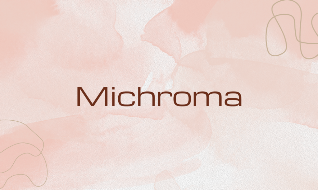
Why it is an Iconic 1960s font: Michroma’s modern and streamlined look fits the modern and futuristic themes of the late 1960s, though it is a contemporary font.
12. Optima

Why it is an Iconic 1960s font: Designed in the 1950s and becoming popular throughout the 1960s, Optima is a humanist sans-serif that uniquely blends sharp and soft styles, reflective of the era’s typographic experimentation.
13. Recoleta
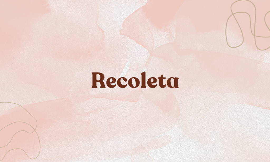
Why it is an Iconic 1960s font: Combining a variety of 1970s typographic traits, Recoleta channels the groovy and funky feel of the late 1960s and early 1970s.
14. Runya

Why it is an Iconic 1960s font: Runya reflects the minimalistic and geometric styles that were popular in the 1960s, though it is a modern creation. Characterized by its simple, clean lines and uncluttered appearance, it works well in contemporary and vintage-inspired projects alike.
15. Sackers Gothic
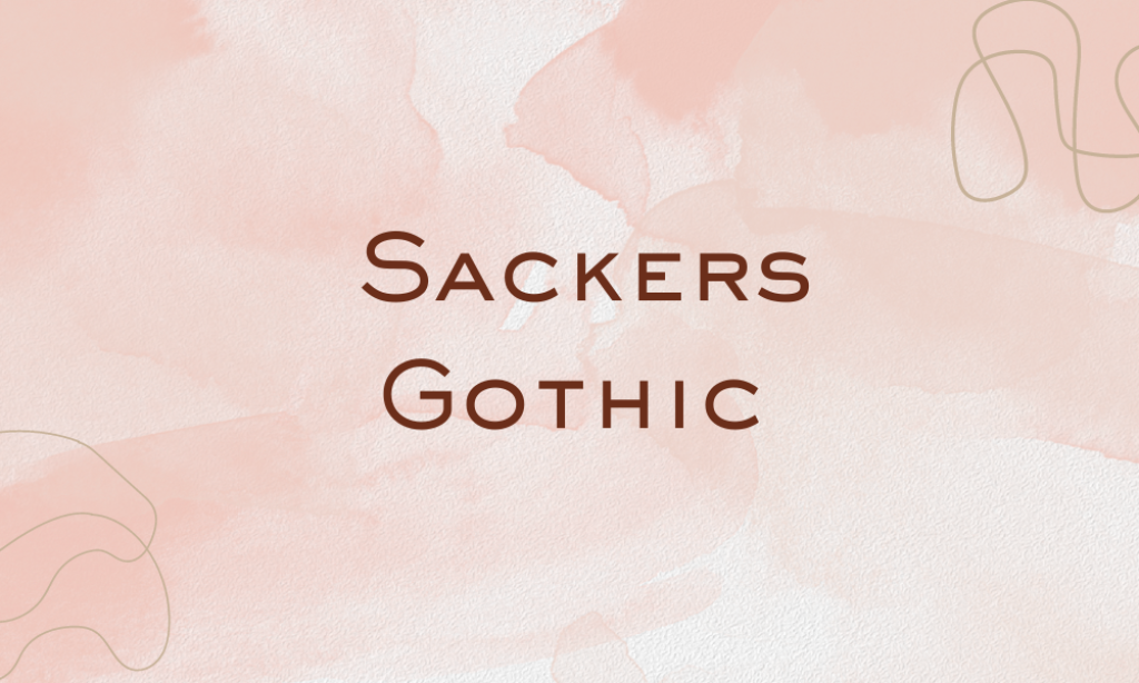
Why it is an Iconic 1960s font: This font’s minimalist and classic letterforms were a favored choice for formal invitations and stationery in the 1960s, reflecting the elegance and simplicity valued in mid-century graphic design. A monoline, sans-serif typeface with uniformly thin strokes, perfect for high-class occasions and sophisticated branding.


